It’s 7am and the sun isn’t even up yet – winter really is not agreeing with me. Thankfully we leave for Europe on Friday and apparently the sun is up in Berlin at 4:30 in the morning. Hooray!
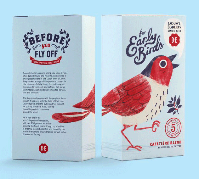
Do you also need at least two cuppa’s to face the dark and cold world? Then you are going to love this packaging from Douwe Egberts – Simply divine.
(Found via Free Flavour)
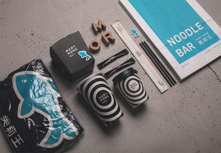
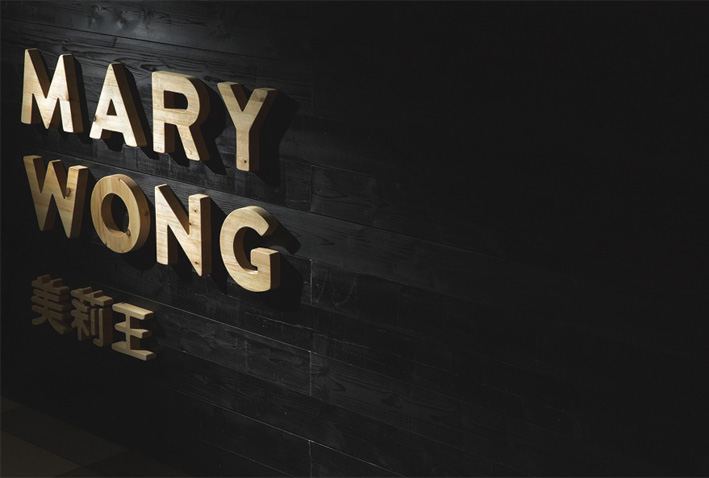
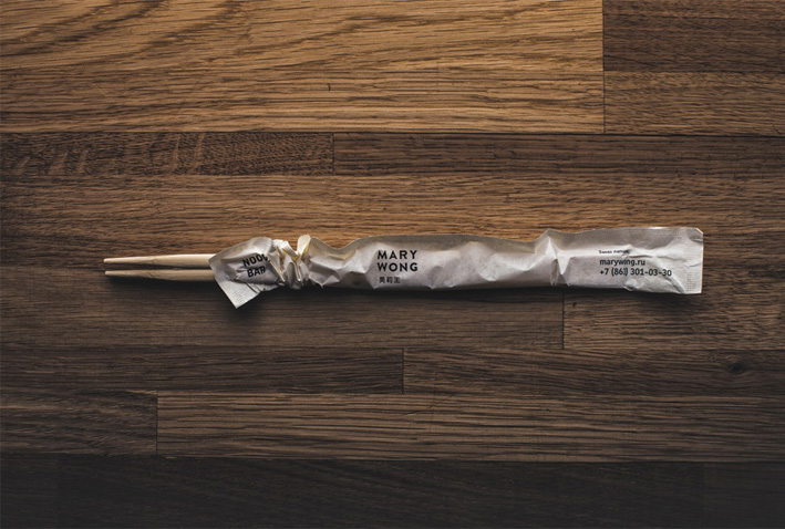
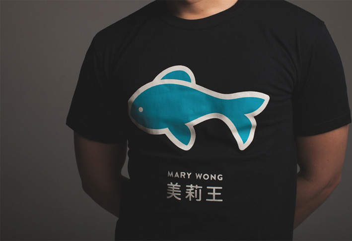
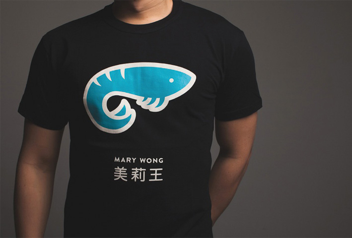
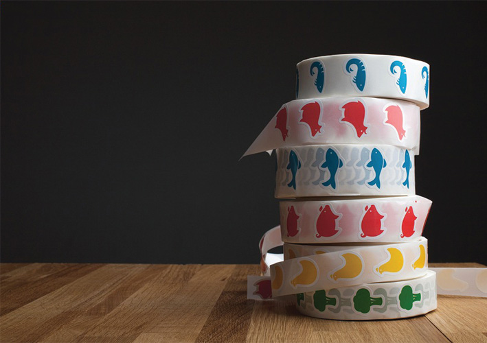
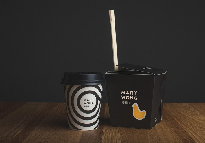
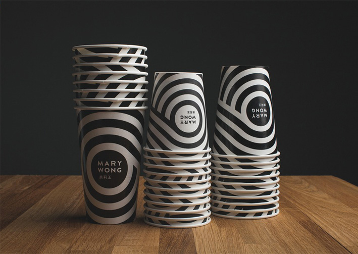
Okay, time for another Branding Love experience – it’s no secret that I have a soft spot for amazing packaging, and this Branding Love installment is my latest “wish I had done that” moment: Mary Wong designed by Made By Fork.
Mary Wong is a chain of Noodle Bars found in the Russian city of Rostov-on-Don. Their Asian and American flavour combinations are cleverly reflected in the fresh and clean design aesthetic.
I love the simplicity of the typography and the naivety of the illustrations. All in all a really gorgeous execution.
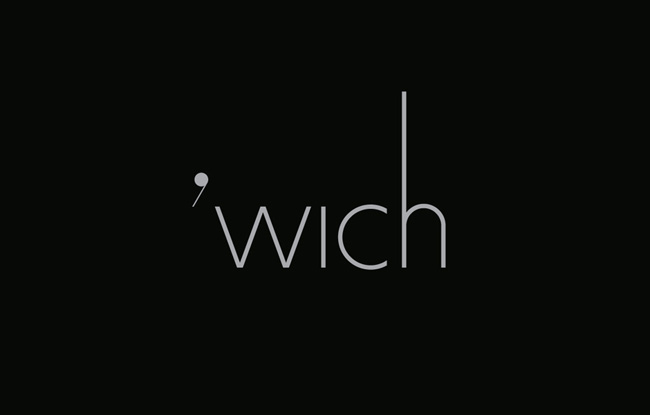
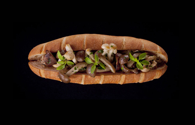
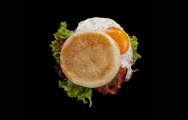
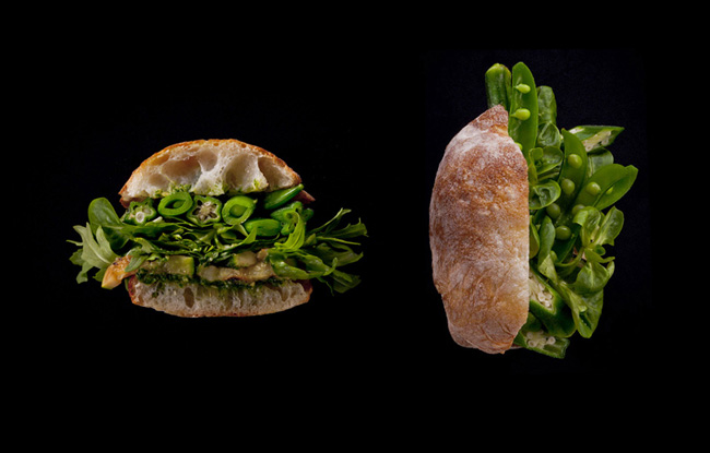
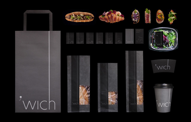
I am a sucker for amazing packaging, but it never occurred to me that even the humble sarmie could be tweaked to such perfection.
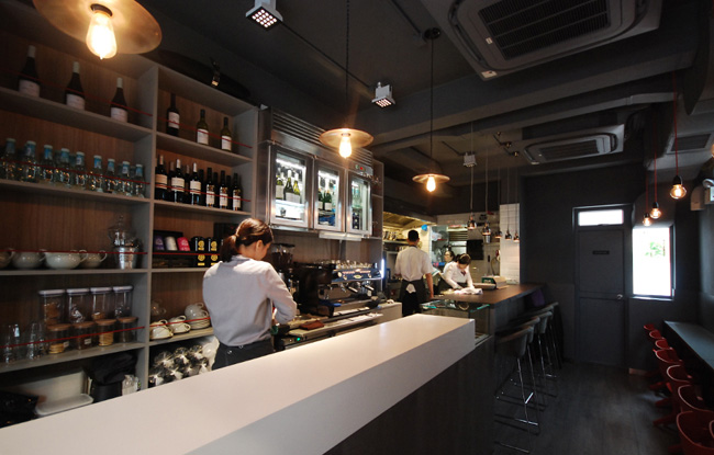
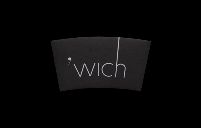
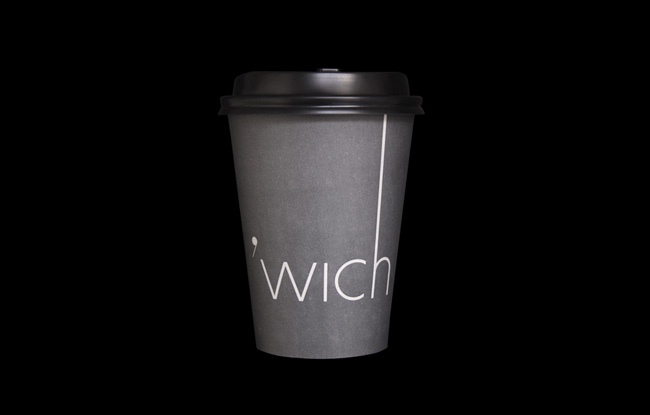
Check out Wich, a concept sandwich store in Hong Kong. They serve all sorts of lunch time goodness, from freshly made soups and salads to the humble (and very glamerous) sandwich. Everything is precise and perfect. The store is pristine and beautifully designed. The packaging is clean and elegant – all in all a graphic designer’s dream.
Blow (a Hong Kong based design agency) are responsible for this stunning branding experience. You can read more about them here.
At first glance, you may be forgiven for thinking that Bardot is a naughty underwear store – the shop front with its frosted windows and suggestive signage doesn’t scream traditional ice cream parlor, instead it hints at a much more saucy experience. (Shop designed by award-winner architect Ana Henton)
“At Bardot, we don’t sell ice cream bars. We sell Love. On a stick.”
The luscious red lips and retro inspired graphic patterns set this store apart. Bardot has turned the humble ice cream bar into a sensual fashion experience.
Bardot’s clever branding is thanks to Landor Associates (a design agency in San Francisco). Landor have managed to turn a once obscure manufacturer, formally known as “Advanced Ice Cream Technologies”, into one of the sexiest ice ream vendors in the USA – Bardot.
With flavors including “Honey I’m Home”, “French Kiss”, “Acapulco Love” and “The Forbidden Fruit” one can easily see why these gorgeous ice cream bars are such a hit – what’s even better is the packaging is specially made to keep the bars chilled for up to eight hours – just enough time to set the mood?
The branding for Bardot has gone on to win Landor Associates numerous design awards including a Silver Clio and bronze Lion at Cannes.
Find out about Bardot.
Read more about Landor Associates here.
Originally spotted on The Die line.
Find out about Bardot.
Read more about Landor Associates here.
Originally spotted on The Die line.